2010年7月10日

Matthew's Choice Brand Design / 馬修嚴選品牌規劃設計


We were very excited for the opportunity to work with Matthew, who is one of the pioneers of Taiwanese yogurt drinks (when he worked for the biggest food manufacturer in Taiwan) on his own premium brand yogurt. We began working with him on the outset, starting with name and brand storming. Selecting "Matthew's Choice" which represents both his tough screening process for the best organic and natural ingredients, and his personal choice of leaving the comfort of the corporate world for his dream and to work on something which is so personal.

對於能夠和身為台灣優格界先驅者之一的馬修合作,我們感到非常興奮。他曾經在台灣最大的食品公司工作,現在則創立了自己的頂級優格品牌。我們和他的合作從外在的表現方式開始,尋找合適的名稱與品牌經營模式,最後選擇以「馬修嚴選」做為品牌名稱,除了表達他個人對於使用有機與天然素材的堅持之外,也展現出他選擇離開舒適的企業環境,為完成個人夢想而奮鬥的決心。


The internet has become such an important channel to communicate with users
for the brand image and packaging, we took the brand pillars "Healthy, Sustainable Lifestyle" to heart, creating a look that communicate these values and the premium position of the brand's products, which extended to the product packaging and presentation.

For the gift box, we used the locally produced rock paper (made of 70% rock and 30% PE) for it's ability to help keep the yogurt cool as it travels, and because no glue or printing was used for the box, the materials can be returned to the supplier through Matthew's Choice for re-production with the most minimal waste, creating a true "cradle to cradle" environment that is both pleasant for the consumer and friendly to the planet and consumers.

網際網路是現今與使用者溝通品牌印象與包裝的一條重要管道,為了將「健康永續的生活方式」這樣的理念傳達到消費者心中,我們透過視覺來表現它的品牌價值與頂級的產品定位,並且延伸至外包裝與宣傳品上。

針對馬修嚴選的禮盒,我們選用由百分之七十岩石成份和百分之三十PE構成的本地產石頭紙作為包裝素材,它除了能夠在運送途中讓優格保持在低溫狀態,而且因為採取無膠、無印刷的製作方式,消費者能夠透過馬修嚴選將使用過的包材送回供應商手中進行再利用,將浪費減到最低,真正實踐了「從搖籃到搖籃」的願景,無論對消費者還是對環境來說都是相當友善的設計。


For Matthew's Choice we wanted to create a very personal experience where the user can feel like they are interacting with Matthew personally and on an one on one level, and they can get the "taste" of the yogurts in their mouths as they read and see the images on the website.

我們相當期盼能為購買馬修嚴選產品的人們創造特別的個人經驗,讓消費者感覺自己是以一種水平的模式和馬修進行一對一的互動,讓他們在閱讀或觀看網站上的圖像同時,嘴裡彷彿也「嚐」到了優格的滋味。


Social networking tools like Facebook and YouTube and Journal Blog were also implemented so that the consumer can have a very personal and one on one access with both Matthew and the brand.

We are very happy with the result and the reception of the public on seeing and interacting with the brand, on a personal level, this user "unpacking" the whole experience really moved all of us in a profound way, thought we'd share it with you also here.

我們運用了數種社群網路工具,像是Facebook、Youtube和部落格等,讓消費者能夠和馬修嚴選這個品牌或馬修本人進行個人化的一對一接觸。

讓我們感到最欣慰的一點是大眾對於這個品牌的接受度,從個人的角度來看,消費者「開箱」的整個過程真的讓人覺得非常感動!正是因為如此,我們希望能夠在此與您們分享。

台南市政府特殊感謝狀設計 / Tainan City Special Thank You Certificate Design


We were approached by the director of the Tainan Cultural Center to create a special thank you certificate for Chi Mei Corp. for donating a Steinway piano to the Cultural Center, we cut this design out of a thick piece of acrylic, and notice the shape of the Steinway piano in the center with the text. A special hand made gift box was also created for handling. An interesting exercise for us.

為了感謝奇美實業捐贈Steinway鋼琴給文化中心,文化中心主任請我們為他們設計一個比較特別的客製感謝牌,我們使用了一塊很厚的壓克力下去加工使用,將設計注重在加工與細節(如可以在獎狀的中間看到Steinway鋼琴的形狀),另外我們也為他特別製作了一個精裝的禮盒,以便運送與保存,蠻有趣的一個設計小品。

2010年6月17日

JZN Scroll poster design 舊振南餅店捲軸海報設計


This special JZN scroll was created with the brand visual image we created earlier which you may remember seeing in High Speed Railways Stations. The idea is to further cement the idea of JZN pastry as "art" concept which we've developed for the JZN brand. We thought it as an interesting way to interact with long time supporters of the brand, that they can "preserve" the beauty of JZN pastries.

這個舊振南的特別捲軸是從我們之前為舊振南設計的品牌視覺所延伸(您可能有在高鐵站看過...),想法是利用捲軸方式呈現,與就振南的好朋友們互動,讓他們可以透過捲軸珍藏舊振南的餅藝。

2010年5月10日

Univacco Metallic Foil Flyer Design / 岱稜科技燙金產品系列DM設計


Working with the Univacco team is always a very happy and creative process, often filled with joyful outbursts, we are happy to be able to work with Lynnette of Univacco who knows what she wants, yet allows us the freedom to experiment in reaching that vision. Here are some of the results of the collaboration, from idea to final printing. We are happy how they turned out.


跟岱稜科技的Lynnette一同合作是一個很愉快並且充滿創意的工作過程,常常有許多瘋狂大笑的時刻,相信也是在這樣子的愉快工作過程中,讓大家的創意可以自由發揮,很高興Lynette也很清楚她想要的,但也給我們許多空間去發揮。所以我們相當的高興從想法一直到印製,都是相當愉快流暢的,很高興看到作品的結果。

2010年2月15日

Energy Farm Brand Website and More 元氣牧場網路行銷

Share


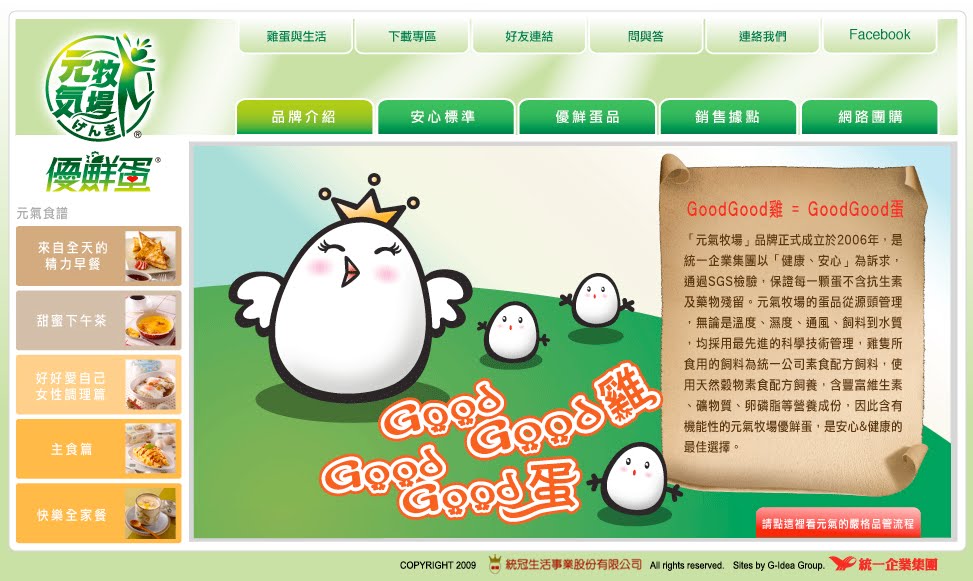
For the Energy Farm Brand website, in order to create a memorable user experience, we conducted an extensive research on what our consumers wanted and would appreciate in our website, and the conclusion was: good egg recipes and reliable health information. With this knowledge, we also applied our belief of simple and friendly interface design, minimal text and usage of multimedia and illustrations when possible in creating websites. The result was a brand website many Uni-President PMs remark as "different and unique" compared with the company's usual website for it's many brands.

Using the website as a starting point, we also reached out to our users through the usage of social networking tool "Facebook", offering useful health and egg related information, as well as Energy Farm info updates. As well as iHergo group purchasing platform, to offer online users another way to interact with the Energy Farm brand.

在開始製作元氣牧場優鮮蛋品牌官網前,我們做了深度的消費者調查,了解我們的使用者在元氣的網站上面,希望得到的什麼樣的資訊或資源,他們告訴了我們:蛋食譜、以及蛋的相關健康資訊,使用這個做我們的出發點,我們請了電視、網路知名的林秋香老師特別為元氣牧場開發的健康養身食譜。套過好點子製作網站的記個哲學:1.簡單友善的使用者介面、2.文案使用盡量簡單有力、3. 多多使用多媒體影片以及圖片表格來溝通資訊,創造出元氣牧場優鮮蛋的官網,完成後也很高興聽到多位統一的夥伴們說這個網站比起統一許多其他品牌網站,相當的獨特,消費者反應也都相當的好。讓元氣牧場在新的一年的銷售,有很好的開始。

除了官網之外,我們也使用了臉書Facebook來提供使用者最新的蛋食譜、健康資訊,以及元氣牧場的最新活動消息。另外還使用了愛合購,希望帶給喜歡參加網路團購的網友們一種新的元氣牧場品牌經驗。這次真的很高興可以將我們對網路設群的觀念與想法,運用在統一的品牌運作上面,也很榮幸與元氣牧場優秀的團隊合作,讓我們有許多新的學習與收穫!


minimal text & lots of illustrations / 少字多圖的哲學

many recipe selections / 許多的美味蛋食譜選擇

recipes are print friendly / 可以友善列印使用的食譜

Facebook Page / Facebook頁面

Energetic iHergo page / 有元氣的愛合購頁面

YouTube Page / YouTube 影片頁面


video multimedia usage / 影片多媒體使用

video multimedia usage / 影片多媒體使用

Links to Energy Farm sites:


歡迎您實際到以下元氣牧場相關連結逛逛:


2010年2月7日

Siraya Chinese New Year's Card 西拉雅國家風景區賀年卡

Share


We're very happy for the opportunity to create this New Year's Card collection for the Siraya National Scenic Area, the card was also printed on Rock Paper, a eco-friendly material we have been using and experimenting with.

很高興可以為西拉雅國家風景區設計今年的賀年卡,外面所使用的海精神logo是我們為西拉雅國家風景區所設計的“牽手西拉雅”標誌,這張卡片也是使用相當有環保概念的石頭紙,最近透過在多件作品當中都嘗試使用石頭紙, 更加了解石頭紙的特性。

2010年2月2日

Liouguei Soap Project 六龜手感皂行銷包裝計畫

Share


G-idea is very happy to unveil the results of our typhoon Morakot relief assistance project Liouguei Soap. From the choice of soap type, to the branding of the project using "hands", as the women of Liouguei uses their hands to collect fruit before, and now use it to make hand-made soap. As Chinese believe with palm reading that our hand documents our life, and tells our story. In a way, we wanted the project to speak of their personal struggle and triumphs, as they continue to toil hard and work even amidst the hardest circumstances. We are very grateful for the trust and encouragement of the NCKU (National Cheng Kung University) team who fought with us, and went the extra mile to help us protect our creation. This is one of our efforts which we are all very proud of, in it's purpose and result!

好點子很高興終於可以與大家分享我們六龜手感皂的作品,我們盡一點點力量協助六龜八八水災後重建所作的計畫,從協助選擇製造的皂形,到整個產品、想法的概念,包裝、影片,我們選擇使用“手”來作為這個產品、故事的傳達主軸,因為水災前,六龜的婦女是用他們的雙手來採蓮霧,幫家裡帶來多一份的收入,但是水災後,許多蓮霧圓都沒有了,所以現在他們開始製作手工肥皂,過程雖然很辛苦,因為需要重新學習新的技術,但是他們還是勇敢面對人生的挑戰。手同時其實也記載著我們的故事,因為年紀、工作,在手上所留下的痕跡、記錄都是不同的。我們在參與這個專案時,被許多人的生命力,以及努力而被感動,很高興可以參與這個很有意義的專案,讓我們覺得我們所作的,也可以帶來一些不同與改變,也很謝謝成功大學負責這個專案的團隊(Ivan and Aries)所給我們信任與支持,謝謝您們為我們堅持好點子的設計與創意。對這個作品的目的與結果都感到很驕傲!也教了許多好的新朋友!


2010年1月31日

Funjili Packaging 益生唐凡吉力包裝


We are very excited to complete the new Herbal Plum packaging for Funjili, created by the famous century old herbal store in An-ping, Tainan. In the beginning we went for a "Chinese" looking concept because of the Chinese medicine, herbal element. But due to the challenge and suggestion of the Funjili team, we ended up with a much younger, brighter work. Using the "health" and "bright" nature of herbal medicine to communicate the product. If you haven't tried herbal plum, please give it a try, because I think like us, you will find that they work so perfect together.

我們很興奮終於可以亮相我們為安平百年的益生堂中西藥局所設計的凡吉力中藥蜜餞新包裝,一開始我們的設計是採用現代中華的方現出發,但是經過凡吉力年輕的團隊的挑戰與溝通後,最後做出這個相當活力大膽的包裝,採用中藥應該給人健康、明亮的本質,希望可以帶給年輕的消費者全新感受。要是您沒有吃過中藥蜜餞,我們真的很推薦您試試看,雖然一開始可能會懷疑到底適不適合,但是吃了之後,就不會再想吃到沒有中藥的蜜餞了,因為兩者搭起來,真的可以說是絕配!

2009年12月25日

JZN Brand Website / 舊振南餅店購物車、品牌形象互動網站設計規劃


Throughout our brand image re-making process of layout, packaging, videos and now website, we focused on two key topics. First is the positioning of the brand as not only a pastry maker, but an artisan that can represent Taiwan in this regards, making art works. Second is how to interact with the consumers, and how to make their experience a pleasant one. With these two aims, we present you the JZN Brand and Online-Store websites.


在我們的舊振南餅店形象整合過程當中(包含了形象、平面、兩個iF設計獎得獎包裝、形象影片、網站),我們一直試著在作好兩件事,那就是溝通舊振南的品牌定位,說我們不只是做伴手禮或喜餅的廠商,而是有可以做華人餅藝代表的身分,做出如藝術品的產品。同時我們在所有的設計過程當中也都考慮到了使用者他與品牌互動的經驗以及使用時的感受旅程。希望您也可以網站裡面看到這幾點。


2009年12月12日

Tainan Cultural Center's 25th Anniversary Invitation/Ticket Design 台南市立文化中心25週年紀念票/邀請卡設計


G-idea is very happy for the opportunity to design the special ticket/invitation card which commemorative the 25th anniversary of the Tainan Municipal Cultural Center. Instead of looking back at the last 25 years, director Chen wanted us to begin at year 25 to look at the next 25 year, hence the theme for the 25th celebration : Transformation and Imagination. So we picked white, using a new material called Rock Paper (paper made with rock, entirely without paper) as our beginning point to create a clean slate for the new possibilities ahead. In case if you haven't guessed, the PVC piece, which is cut in the shape of the center's building is the special ticket that gets you into the celebration.

好點子很高興可以為文化中心25週年設計紀念票及邀請卡,中心陳主任在設計過程中強調,不希望我們去回顧過去的25週年,而要我們一起想像中心未來的25週年,配合中心25週年的主題:轉變與想像。所以我們採用白色(無限的可能性)作為開始,特別選了石頭紙(完全沒有使用紙漿)這個新的環保材質作為主要媒介,要是您在想:票在哪裡,票就是中間那張形狀如中心建築物的PVC卡。

2009年12月5日

R+ Health Packaging Design / 瑞特益包裝設計


For the new R+ packaging design, we wanted to bring a certain freshness to the field of health products design. With Chihsin's (our partner) blessings, I think we created a fairly modern and clean look which targets the upper part of the market.

在這次瑞特益包裝設計計畫中,我們試著做出一個比較現代跟乾淨的包裝,因為與吉信(這個包裝的合作夥伴)溝通完後,認為這樣的設計比較能夠適合他們所要經營的高階市場。也很謝謝吉信團隊在設計過程的協助與良好溝通,讓我們覺得這個包裝越改越好,真是一個相當快樂的合作經驗!

2009年11月12日

JZN Hand Work Ad / 舊振南手功形象廣告


G-idea is happy to announce that the JZN Hand Work Ad has been completed, after numerous revisions, we are finally able to showcase this work, thanks to the Ten Drum Art Percussion Group and Master Chen Ming-The for collaborating with us on this project, and for JZN team's support and hard work.

好高興可以在這邊與大家分享這部最新的影片,在經過多版的修改後,舊振南的形象廣告「手功」終於完成,也很謝謝十鼓擊樂團的配樂與陳明德老師書法,讓這部影片可以更美!也很謝謝舊振南團隊的支持與堅持,讓這部影片可以順利完成!

2009年10月11日

2009 Tainan Holland Days TV Commercial 府城荷蘭日 電視CF廣告


G-idea is happy to be involved with the Tainan Holland Days for the third time, the footage used in the commercial was from last year's event, this year's event is the biggest one yet! Hope to see you there!

好點子很高興連續三年都有機會參與府城荷蘭日的舉辦,今年的廣告所使用的精彩畫面來至去年的活動,今年的府城荷蘭日的活動內容比去年的又更精彩,希望到事後在現場與您相見!

2009年10月8日

Dutch Design Taiwan 2009 荷蘭影像設計展


G-idea is very honored to collaborated with NTIO (Netherlands Trade and Investments Office in Taiwan) for the Taiwan Dutch Design 2009 exhibition. Showcasing the work of 18 Dutch Designers including: ArchitectenConsort, Atelier Ted Noten, Daniel Saakes, Droog, GRO, Hektik.cc, Hella Jongerius, Maarten Baas, Mecanoo Architecten, Miffy, Moooi, MVRDV, Philips, Princess, Smool, Studio Joost van Bleiswijk, Studio Kiki van Eijk, Tjep., Vlieger & Vandam. G-idea is responsible for the visuals of the exhibition, as well as the exhibition space design, and the exhibition catalogue, exhibition video and exhibition post card set. As always, the NTIO team is a pleasure to work with and we are grateful for this opportunity!

好點子很榮幸可以為荷蘭在台辦事處(NTIO)所主辦的「荷蘭設計影像展」進行設計與執行。展出作品共有18個荷蘭的設計公司和品牌,領域涵蓋工業、產品、時裝及建築設計,其中包含許多已成功進軍台灣市場的荷蘭設計品牌作品,如ArchitectenConsort, Atelier Ted Noten, Daniel Saakes, Droog, GRO, Hektik.cc, Hella Jongerius, Maarten Baas, Mecanoo Architecten, Miffy, Moooi, MVRDV, Philips, Princess, Smool, Studio Joost van Bleiswijk, Studio Kiki van Eijk, Tjep., Vlieger & Vandam等。好點子很感謝NTIO給我們這個機會以及過程當中所有的支持以及協助,真是一個相當愉快的合作經驗,外國人做事方式就是有些地方很不一樣,很值得我們學習的!

Exhibition Catalogue PDF viewer 展覽目錄手冊PDF瀏覽程式

2009年8月15日

JZN 2009 Moon Festival Catalogue 舊振南2009中秋節目錄


G-idea is happy to complete our second Moon Festival Catalogue for JZN. Over our year and a half collaboration with JZN, we have continued to search for, and establish the brand's visual identity. We think that with the Moon Festival 09, we have taken one more step towards defining it. We wanted the catalogue to be a book like experience, letting the reader interact with the beauty, artistry as well as the deliciousness of JZN's traditional pastries. The catalogue features a pull-out poster page (in the center), that let's the viewer see all the flavors of this year's moon cake line up, and doubles to highlight the theme this year: United (with our family) we are strong. The cover features the classic JZN green bean cake, which double as our moon to help us create our theme. Our thanks as always to the JZN team for their support, encouragements and valued inputs throughout the creation process.

好點子很高興今年可以第二次為舊振南設計中秋節目錄,與舊振南合作一年多以來,我們不斷與舊振南團隊一同尋找、嘗試創造、定位出舊振南的品牌視覺風格,我們覺得透過這次的作品,又近一步接近了我們的目標。設計今年中秋目錄時,我們嘗試創造一出個故事般的平台,與使用者互動,透過一頁一頁的翻閱,帶著讀者進入舊振南的品牌世界,呈現出舊振南高貴、藝術般及美味的餅藝。目錄的最中間還有個外拉式海報,上面展示出今年所有月餅的口味(內餡) ,這些排列的月餅同時也帶出了今年的主題:月滿人園。封面圓圓的月亮則是用舊振南的經典產品綠豆椪所作的,在黑暗的夜晚中亮亮照射,希望帶給大家溫暖以及鼓勵。再一次要大大的感謝舊振南團隊,在過程當中給予我們所有的支持、鼓勵,以及寶貴的意見。

2009年7月15日

Univacco Metallic Foil Color Guide Design 岱稜科技燙金膜色票設計製作


G-idea has recently completed the design of Univacco's new metallic foil guide. During the design phase, we first tried to communicate Univacco's global stature (they are the third largest foil guide producer in the world) by giving the color guide a very elegant yet simple cover. Next as frequent color guide users ourselves, we concentrated on the user experience, for ease of use and engagement. We're very happy for this opportunity to work with Univacco from conception to production their new metallic foil guide, which was a fun new experience for us.

好點子為 Univacco 岱稜科技設計新版的燙金膜色,在設計的時候,我們試著在整體的視覺形象上更加溝通出 Univacco 岱稜科技的國際性(岱稜科技是世界第三大的燙金膜廠商),同時因為我們也常常使用色票,所以在使用者的使用便利性,以及使用經驗上也做了許多的思考與討論。很高興從概念的製作,有機會可以與Univacco的團隊一起努力,也帶給我們許多新的經驗!