We are pleased to announce that our MC2U packaging design for JZN has won the 2010 iF Communication Design Award, our second one following Again, New Beginning last year.
Some info about the work: MC2U (Merry Christmas to You) is a special Christmas gift-box packaging of Jiu Zhen Nan's classic pineapple cake. Due to its cute and simple appearance, the packaging was very well received by consumers during the holiday season. Taking the standard gold boxes for the pineapple, we created a very practical packaging, using gold with white to communicate a timeless holiday spirit.
We are very happy for the opportunity to work with Japanese actress and celebrity Rattan Mai Sato for this commercial, it was a very fun experience, and we are very thankful for the amount of support our collaborators at Siraya (including the director) showed for our vision, to make a different type of Taiwan tourism film. Hope that it will give you a taste about what's possible in a Siraya countryside trip!
In coherence with the TA of this product, we wanted to create a very intimate feminine experience for this packaging, taking this main idea, adding the "premium" concept (as this is the premium version of the product) and applying the ease of use "slide out" for modern comfort. We are very happy that a lot of TA for this product communicated to us that they really felt "close" to this packaging...
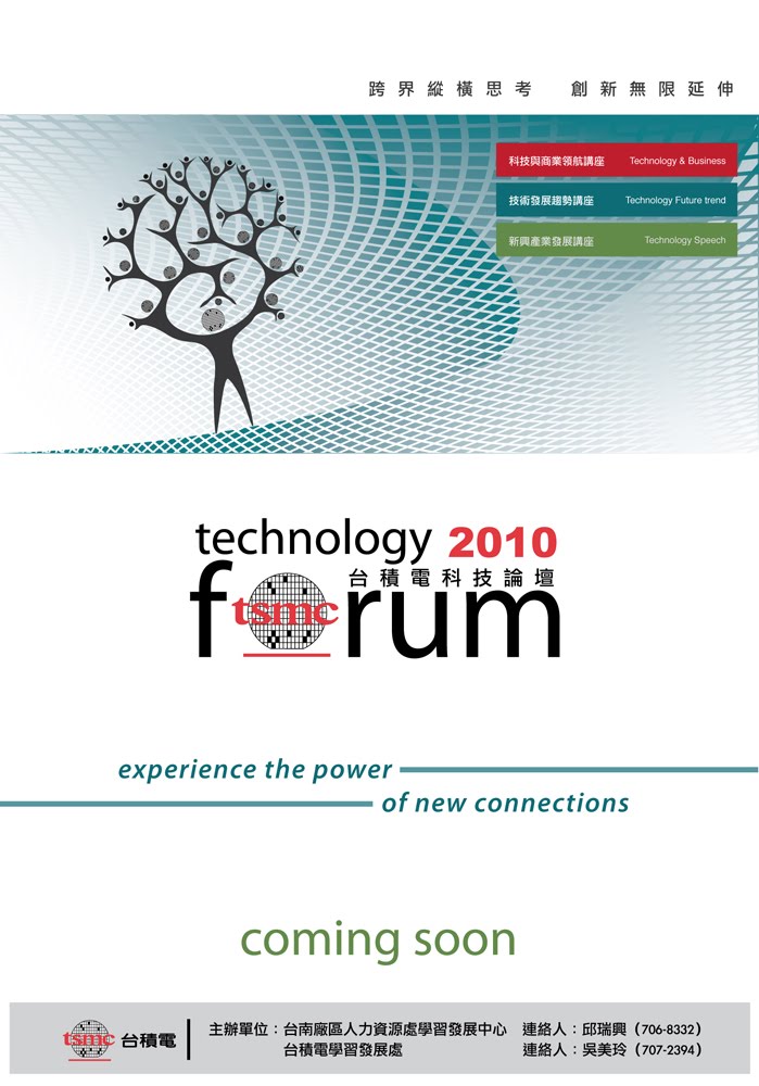
For the 2010 poster design, we created the series logo as well as the main visual image and layout design. The background of the image represents the extension of the possibility of the "wafer" space, which is TSMC's main product and visual element. The tree shaped people element on the left side represents the purpose of the forum series, which is to transfer knowledge and ideas with one another for the benefit of the whole TSMC talent tree. We are especially thankful to Ray of TSMC for his support and encouragement throughout the work process, you guys are really great to work with!
The Siraya dried mangos are not your ordinary dried mangos. Each mango can only be cut twice to produce two slices, and than the drying technique is more thoroughly like that used for Taiwanese caviar production. Each year the production is limited, so it's considered a very prestigious gift. We took all of this into consideration during our design process, and the end result if this work.
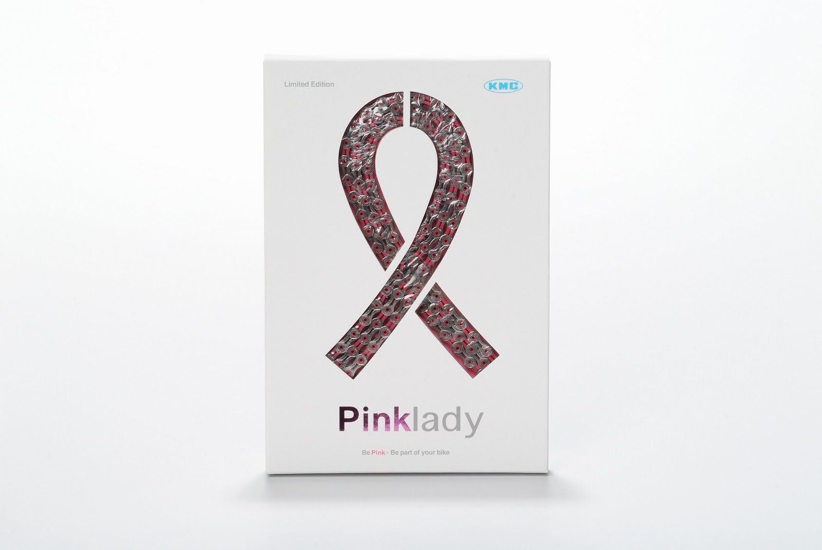
The limited edition Pink Lady packaging is a Pink Ribbon product, so our concept was very simple, why not use the pink chain, and turn it into a pink ribbon, using this concept we branched out into the structure and user experience analysis and created this modern looking gift box design for KMC Chain.
Pink Lady 是桂盟鍊條所推出的Pink Ribbon(粉紅色絲帶)慈善概念腳踏車鍊條商品,也因為是這樣,我們所採取的設計概念非常的簡單,將粉紅色的鍊條變成粉紅色絲帶的形狀,清楚簡單的溝通出所包裝的產品以及這個特殊禮盒包裝的主題。也是透過這個包裝,讓我們有機會可以首次與桂盟相當有朝氣與活潑的行銷團隊合作。
We were very excited for the opportunity to work with Matthew, who is one of the pioneers of Taiwanese yogurt drinks (when he worked for the biggest food manufacturer in Taiwan) on his own premium brand yogurt. We began working with him on the outset, starting with name and brand storming. Selecting "Matthew's Choice" which represents both his tough screening process for the best organic and natural ingredients, and his personal choice of leaving the comfort of the corporate world for his dream and to work on something which is so personal.
The internet has become such an important channel to communicate with users for the brand image and packaging, we took the brand pillars "Healthy, Sustainable Lifestyle" to heart, creating a look that communicate these values and the premium position of the brand's products, which extended to the product packaging and presentation.
For the gift box, we used the locally produced rock paper (made of 70% rock and 30% PE) for it's ability to help keep the yogurt cool as it travels, and because no glue or printing was used for the box, the materials can be returned to the supplier through Matthew's Choice for re-production with the most minimal waste, creating a true "cradle to cradle" environment that is both pleasant for the consumer and friendly to the planet and consumers.
For Matthew's Choice we wanted to create a very personal experience where the user can feel like they are interacting with Matthew personally and on an one on one level, and they can get the "taste" of the yogurts in their mouths as they read and see the images on the website.
Social networking tools like Facebook and YouTube and Journal Blog were also implemented so that the consumer can have a very personal and one on one access with both Matthew and the brand.
We are very happy with the result and the reception of the public on seeing and interacting with the brand, on a personal level, this user "unpacking" the whole experience really moved all of us in a profound way, thought we'd share it with you also here.
We were approached by the director of the Tainan Cultural Center to create a special thank you certificate for Chi Mei Corp. for donating a Steinway piano to the Cultural Center, we cut this design out of a thick piece of acrylic, and notice the shape of the Steinway piano in the center with the text. A special hand made gift box was also created for handling. An interesting exercise for us.
This special JZN scroll was created with the brand visual image we created earlier which you may remember seeing in High Speed Railways Stations. The idea is to further cement the idea of JZN pastry as "art" concept which we've developed for the JZN brand. We thought it as an interesting way to interact with long time supporters of the brand, that they can "preserve" the beauty of JZN pastries.
Working with the Univacco team is always a very happy and creative process, often filled with joyful outbursts, we are happy to be able to work with Lynnette of Univacco who knows what she wants, yet allows us the freedom to experiment in reaching that vision. Here are some of the results of the collaboration, from idea to final printing. We are happy how they turned out.
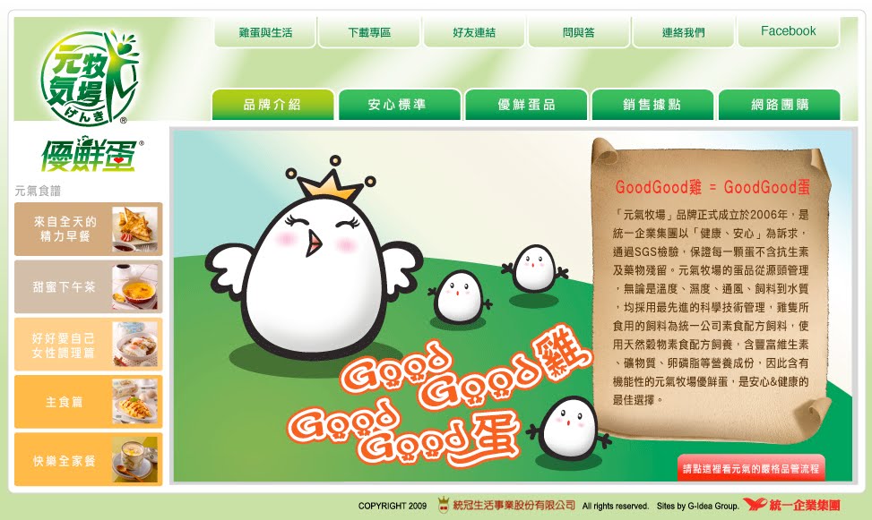
For the Energy Farm Brand website, in order to create a memorable user experience, we conducted an extensive research on what our consumers wanted and would appreciate in our website, and the conclusion was: good egg recipes and reliable health information. With this knowledge, we also applied our belief of simple and friendly interface design, minimal text and usage of multimedia and illustrations when possible in creating websites. The result was a brand website many Uni-President PMs remark as "different and unique" compared with the company's usual website for it's many brands.
Using the website as a starting point, we also reached out to our users through the usage of social networking tool "Facebook", offering useful health and egg related information, as well as Energy Farm info updates. As well as iHergo group purchasing platform, to offer online users another way to interact with the Energy Farm brand.
We're very happy for the opportunity to create this New Year's Card collection for the Siraya National Scenic Area, the card was also printed on Rock Paper, a eco-friendly material we have been using and experimenting with.
G-idea is very happy to unveil the results of our typhoon Morakot relief assistance project Liouguei Soap. From the choice of soap type, to the branding of the project using "hands", as the women of Liouguei uses their hands to collect fruit before, and now use it to make hand-made soap. As Chinese believe with palm reading that our hand documents our life, and tells our story. In a way, we wanted the project to speak of their personal struggle and triumphs, as they continue to toil hard and work even amidst the hardest circumstances. We are very grateful for the trust and encouragement of the NCKU (National Cheng Kung University) team who fought with us, and went the extra mile to help us protect our creation. This is one of our efforts which we are all very proud of, in it's purpose and result!
好點子很高興終於可以與大家分享我們六龜手感皂的作品,我們盡一點點力量協助六龜八八水災後重建所作的計畫,從協助選擇製造的皂形,到整個產品、想法的概念,包裝、影片,我們選擇使用“手”來作為這個產品、故事的傳達主軸,因為水災前,六龜的婦女是用他們的雙手來採蓮霧,幫家裡帶來多一份的收入,但是水災後,許多蓮霧圓都沒有了,所以現在他們開始製作手工肥皂,過程雖然很辛苦,因為需要重新學習新的技術,但是他們還是勇敢面對人生的挑戰。手同時其實也記載著我們的故事,因為年紀、工作,在手上所留下的痕跡、記錄都是不同的。我們在參與這個專案時,被許多人的生命力,以及努力而被感動,很高興可以參與這個很有意義的專案,讓我們覺得我們所作的,也可以帶來一些不同與改變,也很謝謝成功大學負責這個專案的團隊(Ivan and Aries)所給我們信任與支持,謝謝您們為我們堅持好點子的設計與創意。對這個作品的目的與結果都感到很驕傲!也教了許多好的新朋友!
We are very excited to complete the new Herbal Plum packaging for Funjili, created by the famous century old herbal store in An-ping, Tainan. In the beginning we went for a "Chinese" looking concept because of the Chinese medicine, herbal element. But due to the challenge and suggestion of the Funjili team, we ended up with a much younger, brighter work. Using the "health" and "bright" nature of herbal medicine to communicate the product. If you haven't tried herbal plum, please give it a try, because I think like us, you will find that they work so perfect together.
Throughout our brand image re-making process of layout, packaging, videos and now website, we focused on two key topics. First is the positioning of the brand as not only a pastry maker, but an artisan that can represent Taiwan in this regards, making art works. Second is how to interact with the consumers, and how to make their experience a pleasant one. With these two aims, we present you the JZN Brand and Online-Store websites.
G-idea is very happy for the opportunity to design the special ticket/invitation card which commemorative the 25th anniversary of the Tainan Municipal Cultural Center. Instead of looking back at the last 25 years, director Chen wanted us to begin at year 25 to look at the next 25 year, hence the theme for the 25th celebration : Transformation and Imagination. So we picked white, using a new material called Rock Paper (paper made with rock, entirely without paper) as our beginning point to create a clean slate for the new possibilities ahead. In case if you haven't guessed, the PVC piece, which is cut in the shape of the center's building is the special ticket that gets you into the celebration.
For the new R+ packaging design, we wanted to bring a certain freshness to the field of health products design. With Chihsin's (our partner) blessings, I think we created a fairly modern and clean look which targets the upper part of the market.