2009年12月25日

JZN Brand Website / 舊振南餅店購物車、品牌形象互動網站設計規劃


Throughout our brand image re-making process of layout, packaging, videos and now website, we focused on two key topics. First is the positioning of the brand as not only a pastry maker, but an artisan that can represent Taiwan in this regards, making art works. Second is how to interact with the consumers, and how to make their experience a pleasant one. With these two aims, we present you the JZN Brand and Online-Store websites.


在我們的舊振南餅店形象整合過程當中(包含了形象、平面、兩個iF設計獎得獎包裝、形象影片、網站),我們一直試著在作好兩件事,那就是溝通舊振南的品牌定位,說我們不只是做伴手禮或喜餅的廠商,而是有可以做華人餅藝代表的身分,做出如藝術品的產品。同時我們在所有的設計過程當中也都考慮到了使用者他與品牌互動的經驗以及使用時的感受旅程。希望您也可以網站裡面看到這幾點。


2009年12月12日

Tainan Cultural Center's 25th Anniversary Invitation/Ticket Design 台南市立文化中心25週年紀念票/邀請卡設計


G-idea is very happy for the opportunity to design the special ticket/invitation card which commemorative the 25th anniversary of the Tainan Municipal Cultural Center. Instead of looking back at the last 25 years, director Chen wanted us to begin at year 25 to look at the next 25 year, hence the theme for the 25th celebration : Transformation and Imagination. So we picked white, using a new material called Rock Paper (paper made with rock, entirely without paper) as our beginning point to create a clean slate for the new possibilities ahead. In case if you haven't guessed, the PVC piece, which is cut in the shape of the center's building is the special ticket that gets you into the celebration.

好點子很高興可以為文化中心25週年設計紀念票及邀請卡,中心陳主任在設計過程中強調,不希望我們去回顧過去的25週年,而要我們一起想像中心未來的25週年,配合中心25週年的主題:轉變與想像。所以我們採用白色(無限的可能性)作為開始,特別選了石頭紙(完全沒有使用紙漿)這個新的環保材質作為主要媒介,要是您在想:票在哪裡,票就是中間那張形狀如中心建築物的PVC卡。

2009年12月5日

R+ Health Packaging Design / 瑞特益包裝設計


For the new R+ packaging design, we wanted to bring a certain freshness to the field of health products design. With Chihsin's (our partner) blessings, I think we created a fairly modern and clean look which targets the upper part of the market.

在這次瑞特益包裝設計計畫中,我們試著做出一個比較現代跟乾淨的包裝,因為與吉信(這個包裝的合作夥伴)溝通完後,認為這樣的設計比較能夠適合他們所要經營的高階市場。也很謝謝吉信團隊在設計過程的協助與良好溝通,讓我們覺得這個包裝越改越好,真是一個相當快樂的合作經驗!

2009年11月12日

JZN Hand Work Ad / 舊振南手功形象廣告


G-idea is happy to announce that the JZN Hand Work Ad has been completed, after numerous revisions, we are finally able to showcase this work, thanks to the Ten Drum Art Percussion Group and Master Chen Ming-The for collaborating with us on this project, and for JZN team's support and hard work.

好高興可以在這邊與大家分享這部最新的影片,在經過多版的修改後,舊振南的形象廣告「手功」終於完成,也很謝謝十鼓擊樂團的配樂與陳明德老師書法,讓這部影片可以更美!也很謝謝舊振南團隊的支持與堅持,讓這部影片可以順利完成!

2009年10月11日

2009 Tainan Holland Days TV Commercial 府城荷蘭日 電視CF廣告


G-idea is happy to be involved with the Tainan Holland Days for the third time, the footage used in the commercial was from last year's event, this year's event is the biggest one yet! Hope to see you there!

好點子很高興連續三年都有機會參與府城荷蘭日的舉辦,今年的廣告所使用的精彩畫面來至去年的活動,今年的府城荷蘭日的活動內容比去年的又更精彩,希望到事後在現場與您相見!

2009年10月8日

Dutch Design Taiwan 2009 荷蘭影像設計展


G-idea is very honored to collaborated with NTIO (Netherlands Trade and Investments Office in Taiwan) for the Taiwan Dutch Design 2009 exhibition. Showcasing the work of 18 Dutch Designers including: ArchitectenConsort, Atelier Ted Noten, Daniel Saakes, Droog, GRO, Hektik.cc, Hella Jongerius, Maarten Baas, Mecanoo Architecten, Miffy, Moooi, MVRDV, Philips, Princess, Smool, Studio Joost van Bleiswijk, Studio Kiki van Eijk, Tjep., Vlieger & Vandam. G-idea is responsible for the visuals of the exhibition, as well as the exhibition space design, and the exhibition catalogue, exhibition video and exhibition post card set. As always, the NTIO team is a pleasure to work with and we are grateful for this opportunity!

好點子很榮幸可以為荷蘭在台辦事處(NTIO)所主辦的「荷蘭設計影像展」進行設計與執行。展出作品共有18個荷蘭的設計公司和品牌,領域涵蓋工業、產品、時裝及建築設計,其中包含許多已成功進軍台灣市場的荷蘭設計品牌作品,如ArchitectenConsort, Atelier Ted Noten, Daniel Saakes, Droog, GRO, Hektik.cc, Hella Jongerius, Maarten Baas, Mecanoo Architecten, Miffy, Moooi, MVRDV, Philips, Princess, Smool, Studio Joost van Bleiswijk, Studio Kiki van Eijk, Tjep., Vlieger & Vandam等。好點子很感謝NTIO給我們這個機會以及過程當中所有的支持以及協助,真是一個相當愉快的合作經驗,外國人做事方式就是有些地方很不一樣,很值得我們學習的!

Exhibition Catalogue PDF viewer 展覽目錄手冊PDF瀏覽程式

2009年8月15日

JZN 2009 Moon Festival Catalogue 舊振南2009中秋節目錄


G-idea is happy to complete our second Moon Festival Catalogue for JZN. Over our year and a half collaboration with JZN, we have continued to search for, and establish the brand's visual identity. We think that with the Moon Festival 09, we have taken one more step towards defining it. We wanted the catalogue to be a book like experience, letting the reader interact with the beauty, artistry as well as the deliciousness of JZN's traditional pastries. The catalogue features a pull-out poster page (in the center), that let's the viewer see all the flavors of this year's moon cake line up, and doubles to highlight the theme this year: United (with our family) we are strong. The cover features the classic JZN green bean cake, which double as our moon to help us create our theme. Our thanks as always to the JZN team for their support, encouragements and valued inputs throughout the creation process.

好點子很高興今年可以第二次為舊振南設計中秋節目錄,與舊振南合作一年多以來,我們不斷與舊振南團隊一同尋找、嘗試創造、定位出舊振南的品牌視覺風格,我們覺得透過這次的作品,又近一步接近了我們的目標。設計今年中秋目錄時,我們嘗試創造一出個故事般的平台,與使用者互動,透過一頁一頁的翻閱,帶著讀者進入舊振南的品牌世界,呈現出舊振南高貴、藝術般及美味的餅藝。目錄的最中間還有個外拉式海報,上面展示出今年所有月餅的口味(內餡) ,這些排列的月餅同時也帶出了今年的主題:月滿人園。封面圓圓的月亮則是用舊振南的經典產品綠豆椪所作的,在黑暗的夜晚中亮亮照射,希望帶給大家溫暖以及鼓勵。再一次要大大的感謝舊振南團隊,在過程當中給予我們所有的支持、鼓勵,以及寶貴的意見。

2009年7月15日

Univacco Metallic Foil Color Guide Design 岱稜科技燙金膜色票設計製作


G-idea has recently completed the design of Univacco's new metallic foil guide. During the design phase, we first tried to communicate Univacco's global stature (they are the third largest foil guide producer in the world) by giving the color guide a very elegant yet simple cover. Next as frequent color guide users ourselves, we concentrated on the user experience, for ease of use and engagement. We're very happy for this opportunity to work with Univacco from conception to production their new metallic foil guide, which was a fun new experience for us.

好點子為 Univacco 岱稜科技設計新版的燙金膜色,在設計的時候,我們試著在整體的視覺形象上更加溝通出 Univacco 岱稜科技的國際性(岱稜科技是世界第三大的燙金膜廠商),同時因為我們也常常使用色票,所以在使用者的使用便利性,以及使用經驗上也做了許多的思考與討論。很高興從概念的製作,有機會可以與Univacco的團隊一起努力,也帶給我們許多新的經驗!

2009年5月19日

好點子「一元復始」禮盒榮獲2009德國iF設計獎


Created for Jiu Zhen Nan (est. 1890), one of the oldest and most beloved traditional pastry brand in Taiwan as a lunar new year gift box.

Inspired by candy trays found in almost all Chinese homes, which holds an assortment of candies and cookies for visiting family and friends.

We wanted to create an unique "opening" experience, where the user sees a wonderful world of treats revealed upon opening, and also make the process as "ready to eat" as possible.

The Four Black Boxes also represent the four seasons, and the Gold boxes in the middle represent the rising sun, which signal a grand beginning to the new year, hence the name "Again, New Beginning"


「一元復始」是「好點子多媒體製作」為台灣百年餅店「舊振南」所設計的春節檔期禮盒。

靈感來自於在過年時所有台灣家庭幾乎都可以看到用來招待親朋好友的糖果拼盤。在這個作品,好點子團隊試著創造出一個獨特的“開盒”經驗,讓使用者可以在打開盒子的過程,體驗到一層層的驚喜,同時也試著讓使用者可以很即時的享受到禮盒裡的點心。

四個黑色的內盒代表著一年裡面四季的循環,中間的金盒子代表著在新的一年當中即將要升起的太陽,祝福使用者在這新的一年裡面可以蒸蒸日上。

2009年5月15日

好點子為 Hawana 設計的品牌產品視覺


This year, G-idea began the brand re-conception process for Hawana, throughout a long discussion and design phase, looking into the brand's characteristics and local audience perception, we're happy to finally come up with the brand visual communication images for this year. Communicating on the lifestyle experiences and journey one can have in Hawana's products.

從今年開始,好點子開始為Hawana品牌重新的設計視覺溝通,透過很長的設計、討論過程,考慮到 Hawana的品牌特性,以及當地消費者的接受性,好點子很高興Hawana的新品牌視覺終於完成,溝通出Hawana產品的「生活功能」以及使用者可以如何與Hawana走出不同的人生旅程!

2009年5月10日

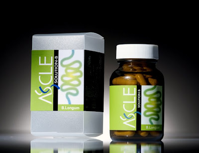
Ascle Solution-B 產品包裝設計


很高興可以與Ascle年輕有為的團隊合作,做出這個比較另類的生物科技產品包裝,在材質以及色彩使用上都是以這個產業來說比較不一樣的呈現方式,很謝謝Ascle團隊的信任以及協助。


2009年5月8日

統一 美研社 試喝活動相關視覺設計


這是好點子為新一波美研社活動所設計的視覺,從海報到延伸的DM文宣,很高興可以繼續與美研社團隊合作。美研社的玫瑰茶真是超好喝的,漣一些好點子的男生夥伴都很喜歡喝,甜度剛好,香又清爽、健康。超推薦!

2009年4月10日

綺麗健康油 新包裝設計


很高興好點子為新綺麗健康油設計的心包裝以將上市,代理商希望能夠透過更有“日本味”的設計,讓消費者可以更加感受到這個產品日本原裝進口的價值感。同時也溝通出健康,還有無負擔感。很高興又是一個作品的完成上市!

2009年4月5日

瑞穗雪糕上市!


很開心期待已久的瑞穗雪糕新包裝設計已經上市,讓這次位好點子為統一重新設計的產品包裝可以問世了!很高興與統一冰品部繼續延伸合作,有機會為這個經典品牌設計包裝。也一起介紹了兩個新的口味(草莓與巧克力),希望大家會喜歡新的口味以及好點子設計的心包裝!

2009年2月25日

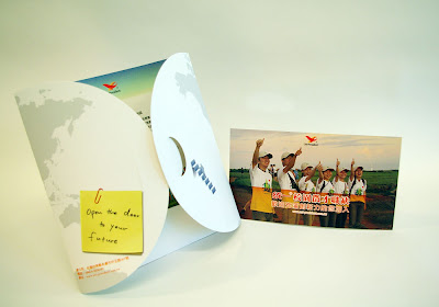
好點子為統一企業公司 設計徵才DM


DM的外觀


從DM的背面打開統一的世界


打開後可以裡面還藏著一張邀請/資料卡


好點子很高興自從兩年前為統一企業設計完徵才DM之後,今年可以再次為統一設計新款的人事部DM,配合今年全新的徵才活動。這次的設計概念,採用地球扁圓形的形狀摺起來成形,帶出統一企業的國際佈局,以及尋照具有國際關敏感度的新同仁。對於這次的新DM設計,好點子很高興有別於上次的概念,感覺好像有更精緻的感覺。能再次與統一人事部合作,感到很榮幸與開心!

2009年1月28日

台南市力圖書館90週年元素設計


好子很高興台南市立圖書館的同仁們對我們這次為90週年設計的標誌及元素感到滿意,在設計90週年元素過程中,試著將圖書館所象徵的知識為真正寶庫,融合進入90的數字當中,讓標誌不但可以標示年份,還可以展現圖書館的精神。


1. 採用「玖O」來取代一般較傳統羅馬數字的呈現手法,來帶出中國感。
2.「O」看起來像中國傳統的錢幣,中間的洞口變換為成一本書冊,呈現出:知識才是真正的財富。
3.「玖」中的「久」簡化為一個人的意向形態,走進右邊的「O」,象徵:歡迎大家走進圖書館這個知識的寶庫。
4. 「玖」看起來有點像「玩」字的外型,象徵閱讀是一個相當愉快的過程。


賀年卡延伸設計


90週年活動大布條 延伸設計


活動布條 貼上圖書館外牆


形象外牆延伸設計